A Riot Games’ Video Game Case Study
Season 1 - September 2019
I have really enjoyed playing and climbing through the ranks of Teamfight Tactics release. The excitement of learning and mastering a new genre of game released by a great publisher has fueled my climb to diamond rank. However, through my climb and playing other auto battlers, I have noticed a few UX/UI changes that can be implemented to improve the player’s experience while playing the game. Below is a list of a few changes I would make to improve the overall interface and user experience.
Adding visual indicators to units in the shop
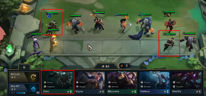
A UX/UI change that has bugged me when playing the game is that there is no indication that you already own a unit, or can upgrade a unit viewing the cards in the shop. This is an issue because the pace of the game has you save up gold, and in a 30-second window, refresh your shop and spend your gold buying the cards to upgrade your units. In the short amount of time you have, it can be pretty hard to keep track of your units and what comes up in the shop if you are consistently rolling and looking for multiple units to upgrade.
The player has 2 one-star units (Pyke) and the option to buy a third in the shop to make a two-star unit.
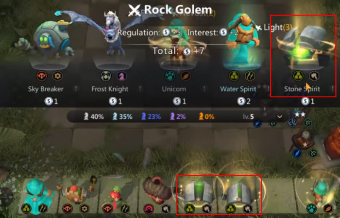
If we look at other games like Auto Chess Mobile, they have added an animated background to units in the shop that you already own and need to upgrade. This makes it visibly easier to distinguish between units in the shop for the player.
The player has 2 Stone Spirits on their bench and a third one shows up (with a visual indicator) in the shop. There is also a visual indicator behind the Unicorn unit indicating to the player that this is a unit they already own.
Suggestion
My suggestion to the UX team at Riot is to add a visual indicator to units that show up in the shop that you already own. This would help high and low-level players prevent errors when refreshing their shop multiple times and scanning for various units in such a short window of time. They could also add an indicator that tells you a unit in the shop shares a synergy with units you already own. This would help newer players learn the synergies between units without having to immediately memorize everything from the start. Overall, both of these changes would help players with error correction and let them focus on the more pertinent aspects of the gameplay without having to juggle too many things.
Season 2 - February 2020
2 stars to indicate you can upgrade this unit
I’m glad to see that Riot has implemented UX/UI changes to Teamfight Tactics that improve the experience for high and low-level gameplay. The change that has helped me the most is their addition of visual flairs to units’ cards that I already own.
Damage Charts
As I dive deeper into the game there is another UX/UI element that I think needs work. This change has to do with the DPS (Damage) chart that they added to show the damage output of each unit in the last fight.
Chart showing Damage of each unit
I think that this is good for the game and helps all levels of players better understand which units are making an impact. I believe that this can be improved upon to help better inform the player of what is going on during fights since units can output multiple types of damage.
Looking to other games that have similar elements, the first one that comes to mind is World of Warcraft and their various meters.
These meters can displaying a multitude of things for raids, dungeons, or questing. Some examples of this displayed data would be damage output, damage taken, healing, debuff, as well as others.
Meter showing the healing output of people in your group.
Comparing these meters, I would recommend implementing three different meters, physical damage, magic damage, and damage taken of units.
A rough prototype of what it might look like (red = physical, blue = magic, green = damage taken)
I like the current DPS chart, but I would add 2 more bars below the unit to breaking down the 2 types of damage they output and the damage they took. This would better inform the player to then make choices on what items work best on various units as well as the impact of the units positioning on the board.
Further thoughts to explore
Looking at League of Legends, I would love to explore the space of suggested items to help newer players understand what units output physical damage, magic damage, and take damage. I have heard a lot from newer players that it is hard to distinguish which units output what kind of damage or which are tanks based on the information given.
I would love to see a deeper breakdown of stats and timestamps in the post-game lobby or match history to be able to reflect on the game and improve the player’s gameplay.
Card games and the like seem to have a drop in player base and popularity between expansions which rise when the new expansions come out and drop off after; The same is happening in TFT. So, I would love to explore more on how to close the gap of content updates/expansions so there isn’t as much of a drop. (Maybe shortening the time between each expansion/new set).
Season 3 - April 2020
I’m excited to see that Riot has implemented an update to damage meters as we have previously discussed.
orange = physical damage, blue = ability damage
They have also announced mid-set updates to each season to bring back the player bases’ interest during lulls in the game.


