Redesigning USDA’s Field Guide for Mobile and Search
A research-led redesign increased mobile usage by 37% across a platform serving 16,000+ monthly users.
Role: UX Designer + Mentor
Team: 12-Person Agile Team
Timeline: October 2022 - March 2023
Methods + Tools: User interviews, usability testing, information architecture, user flows, prototyping
Scope: Search, filtering, navigation, accessibility, and responsive workflows
Overview
The USDA’s Field Office Technical Guide is a public-facing resource used by farmers, conservation planners, landowners, and field staff across all 50 states. It provides guidance for conservation practices, but its complex taxonomy, limited search experience, and desktop-first structure made it difficult to find and use information in the field.
I worked with a 12-person Agile team to improve the platform’s information architecture, search, navigation, and mobile experience. The redesign increased mobile usage by 37%, reduced search-page bounce rate by 33%, and increased average session depth by 21%.
Check out the product at https://efotg.sc.egov.usda.gov/#/
My Role
I was the UX Designer and mentor on the project, working alongside the UX/UI Lead and a 12-person Agile team. I contributed to user research, information architecture, interaction design, prototyping, usability testing, and design direction for the mobile and desktop experience.
I focused especially on the problems that affected field-based users: finding the right guidance, understanding where they were in the information hierarchy, and using the platform outside a traditional desktop environment.
Challenge
Users relied on FOTG for important agricultural and environmental guidance, but the experience made basic tasks unnecessarily difficult:
The taxonomy was complex and did not match how users looked for information.
Search results were difficult to interpret, leading users to repeat searches or abandon the page.
The experience was not designed around field-based mobile use.
These problems were not only usability issues. When users could not quickly find the right guidance, the platform became less useful in the situations where they needed it most.
My Role & Approach
Research & Problem Framing
I began by interviewing users and mapping the existing journey from search to guidance. The research showed that the biggest problems were structural rather than visual: users struggled to understand the taxonomy, interpret search results, and move between related content.
Because field-based users were the least supported by the existing experience, I prioritized mobile workflows early instead of treating mobile as a later responsive adaptation.
Information Architecture & Prototyping
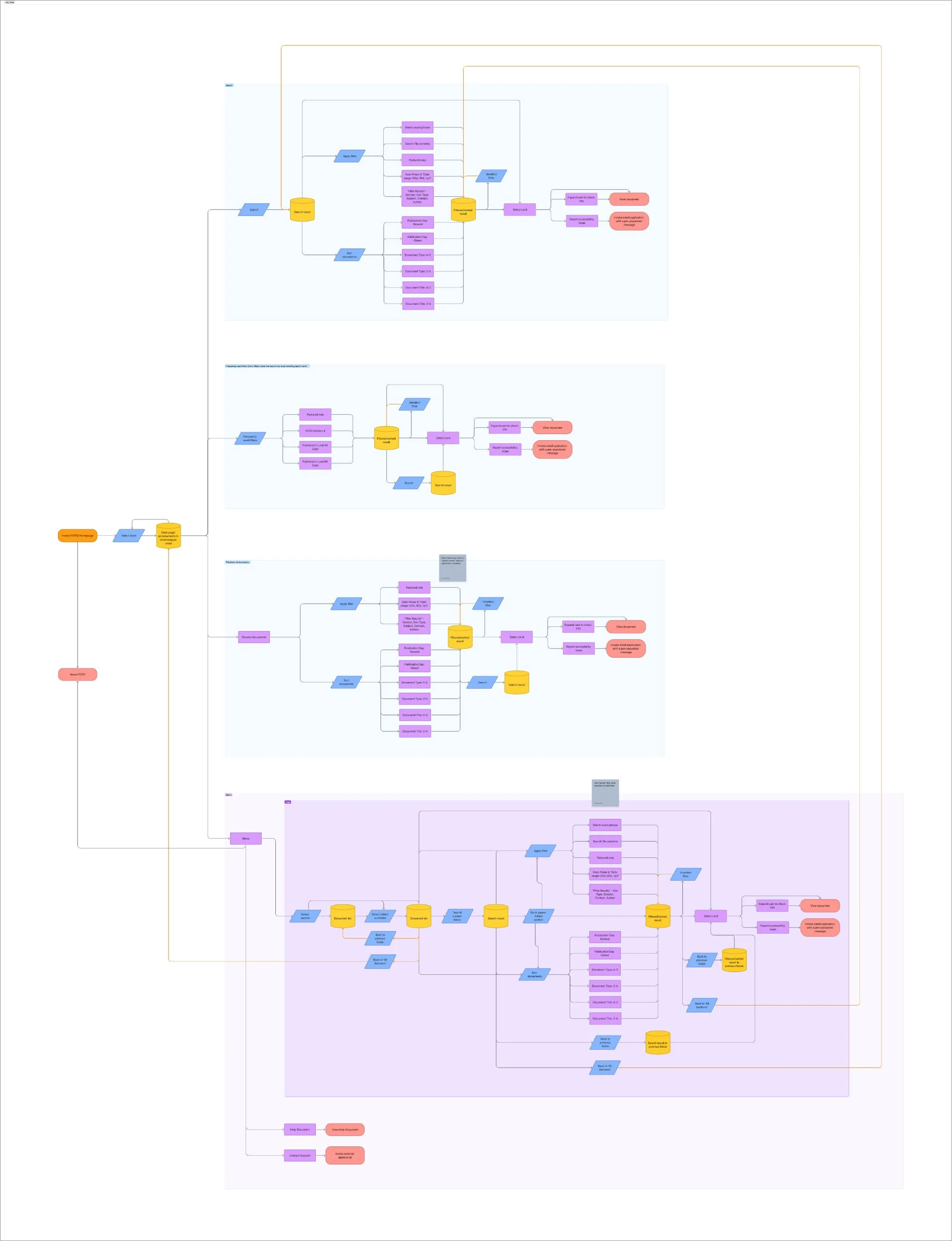
I restructured the information architecture into a clearer tree-view navigation model. The goal was not to expose every category at once, but to give users a predictable way to understand where they were and what related information was available.
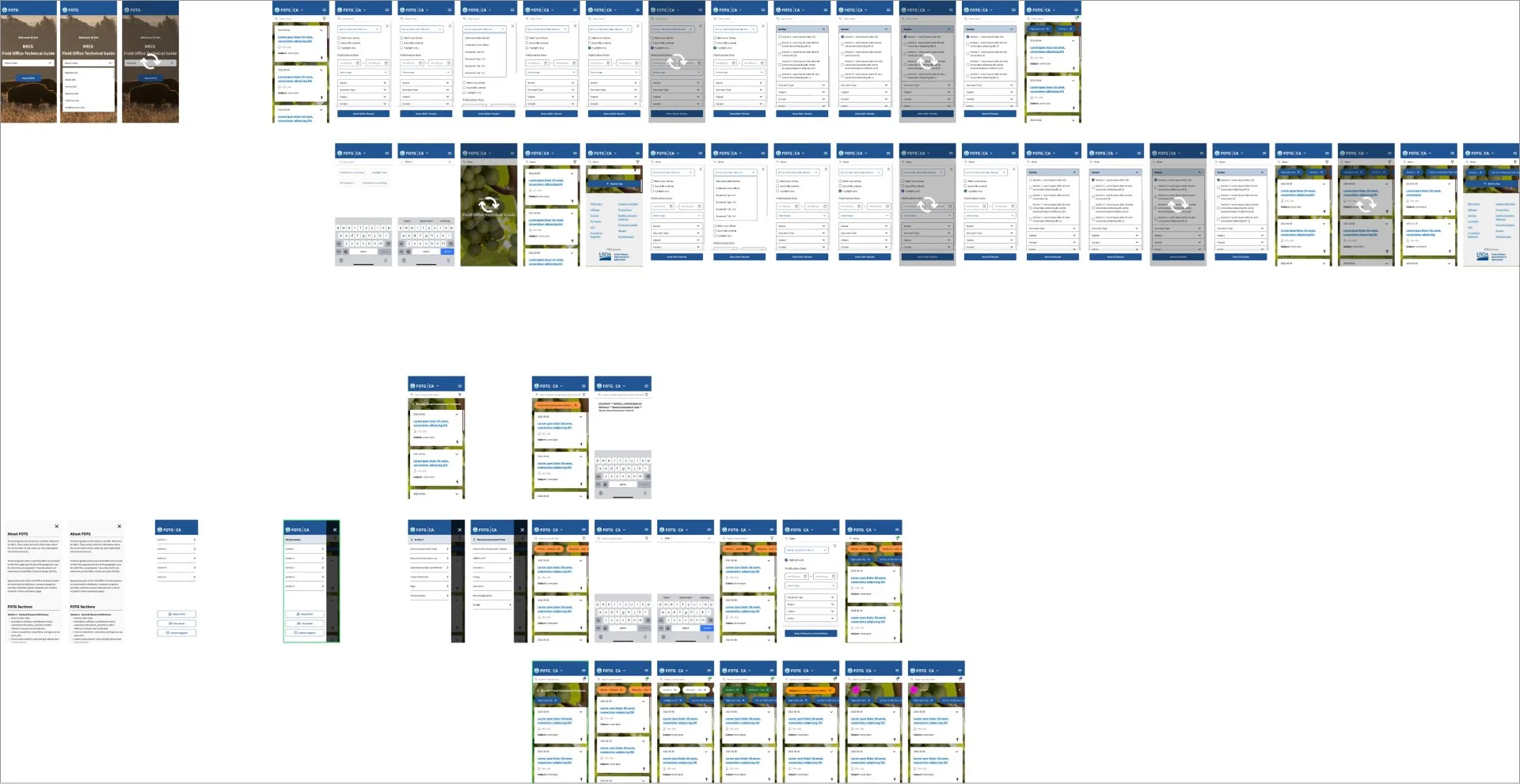
I moved from low-fidelity flows to higher-fidelity prototypes and tested the navigation as it evolved.
Search and Filtering
Search and filtering went through several iterations. The first direction combined too many controls and made it difficult to understand the relationship between search, filters, and results.
Based on testing, I separated the controls, clarified the hierarchy, and refined the interaction model. The final direction made it easier to begin with a broad search and narrow results without losing context.
Design Language and Integration
Rather than introduce an entirely new visual system, I extended USDA’s existing design language on this product. This limited some visual flexibility, but made the redesign easier to integrate with the broader ecosystem and more familiar to stakeholders and returning users.


Impact:
37% increase in mobile usage
33% decrease in search-page bounce rate
21% increase in average session depth
Lower rate of repeated searches per session
Tradeoffs
We chose to extend USDA’s existing design language rather than introduce a completely new visual system. A new system might have created a more dramatic redesign, but it would also have increased integration risk and made stakeholder adoption more difficult.
We also prioritized mobile-first workflows rather than attempting a simultaneous redesign of every desktop experience. This meant accepting some visual and functional differences between platforms in the first release, but it focused the work on the users experiencing the greatest friction.
The result was a less disruptive redesign that could fit into the existing ecosystem and show measurable improvement without requiring a complete rebuild.
What I Learned
This project reinforced that difficult product problems are often structural before they are visual. The biggest improvements came from clarifying the content model, search behavior, and navigation logic rather than simply restyling the interface.
It also strengthened my approach to designing within constraints. The best solution was not the most dramatic redesign. It was the one that improved the highest-friction workflows, respected the existing technical ecosystem, and could be adopted by the people responsible for maintaining it.
More Details + Diagrams Below↓
User Needs + Pain Points


Initial User Flow Diagram
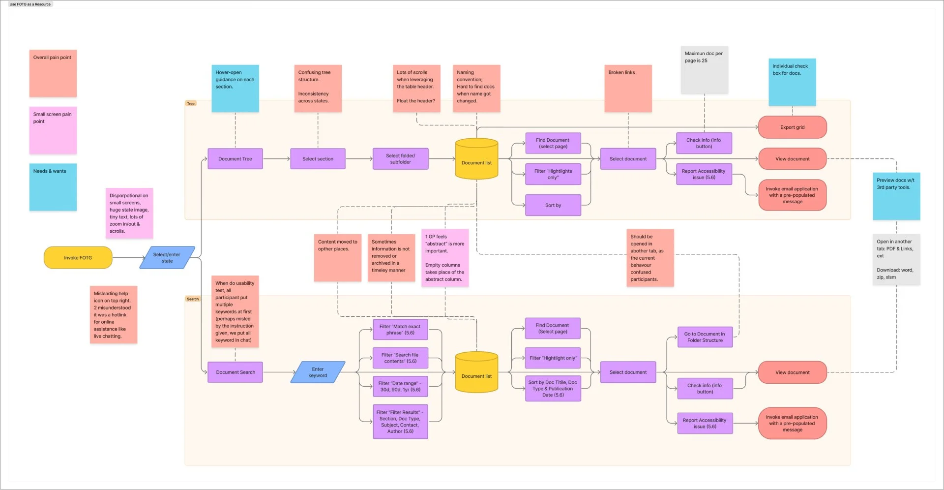
A mobile first lo-fi prototype of existing user flow.

Expanded prototype integrating existing design language.
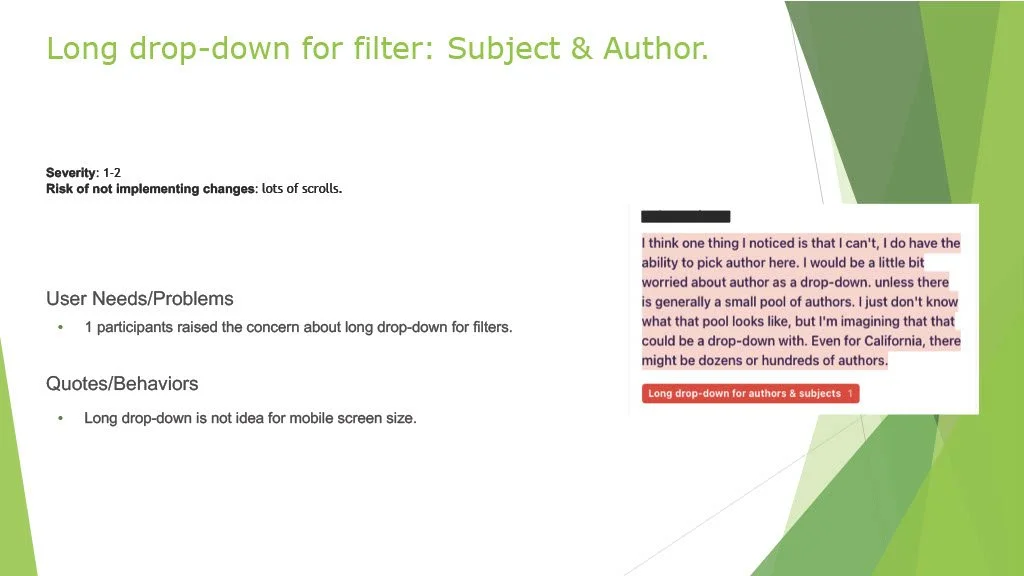
User Research (Usability Testing)








Post Research Prototype